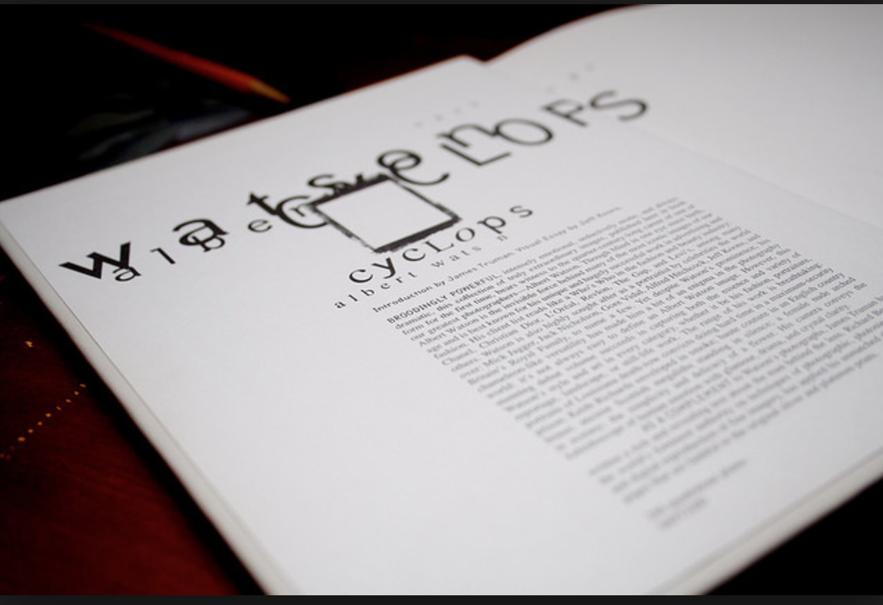
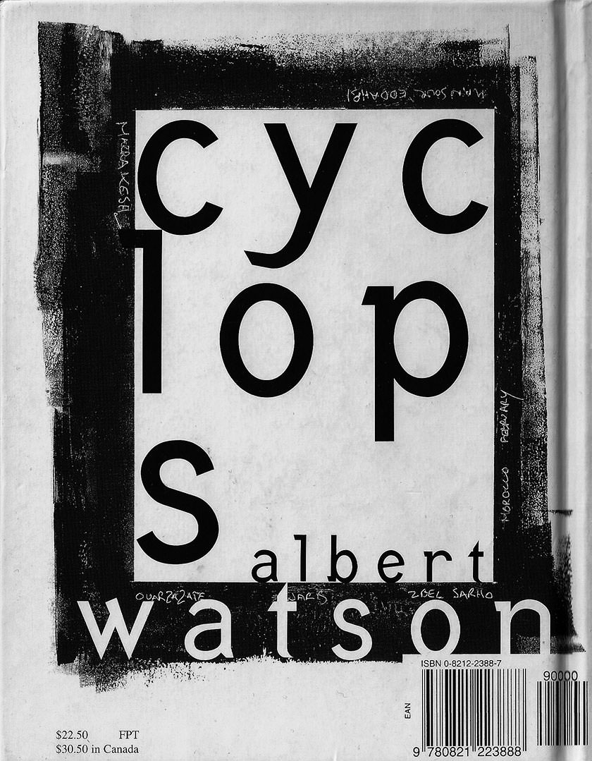
DAVID CARSON FOR CYCLOPS - ALBERT WATSON PHOTOBOOK
David Carson Editorial Design for Albert Watson Photobook
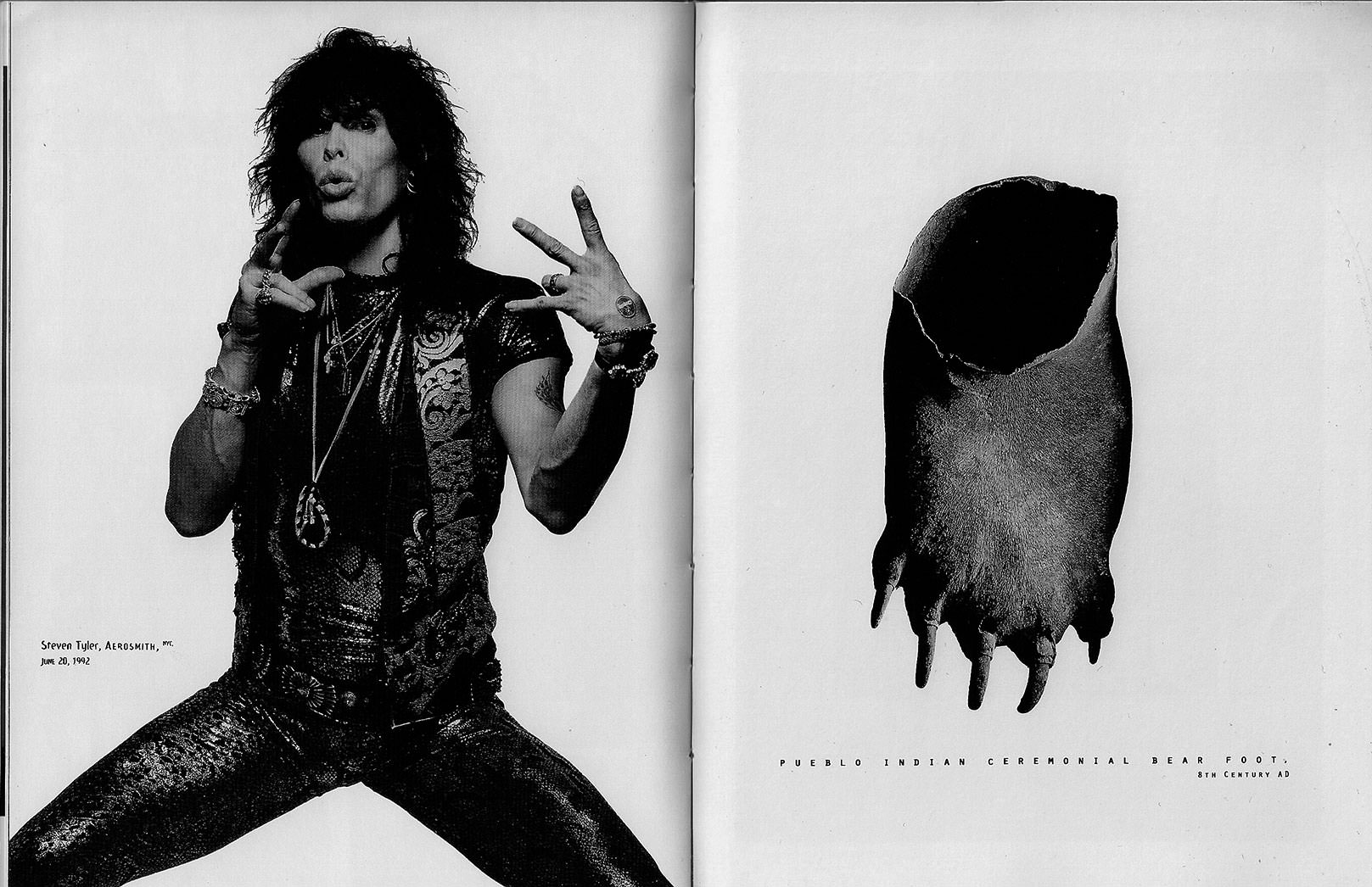
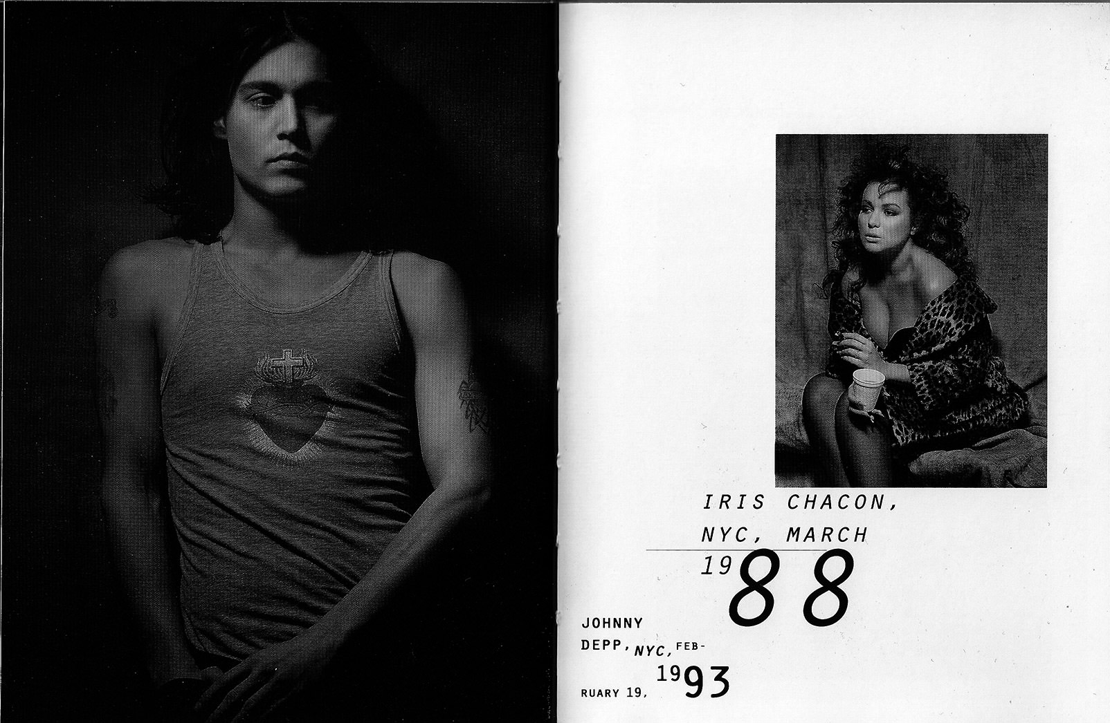
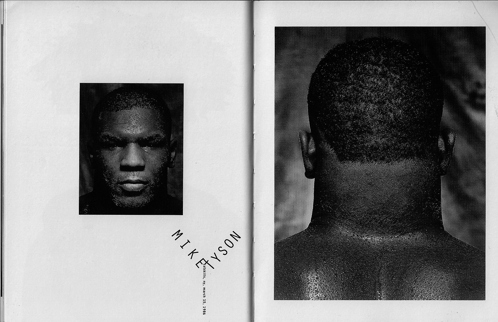
While going into this photobook I would not normally be interested in the kind of commercial photography that is largely exhibited, the power of Watson’s images was hard to deny. I could still feel a powerful mood, sense of history, and artistry in looking at them; whether it be one of the many portraits, artifacts from the Apollo missions, or a snapshot similar to what I gravitate towards as a photographer.
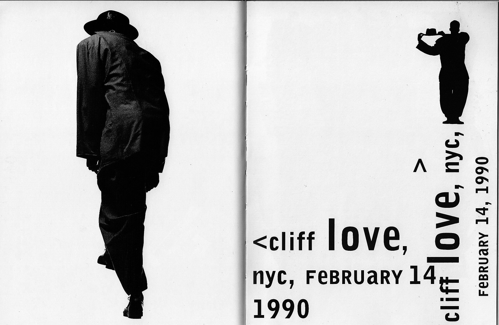
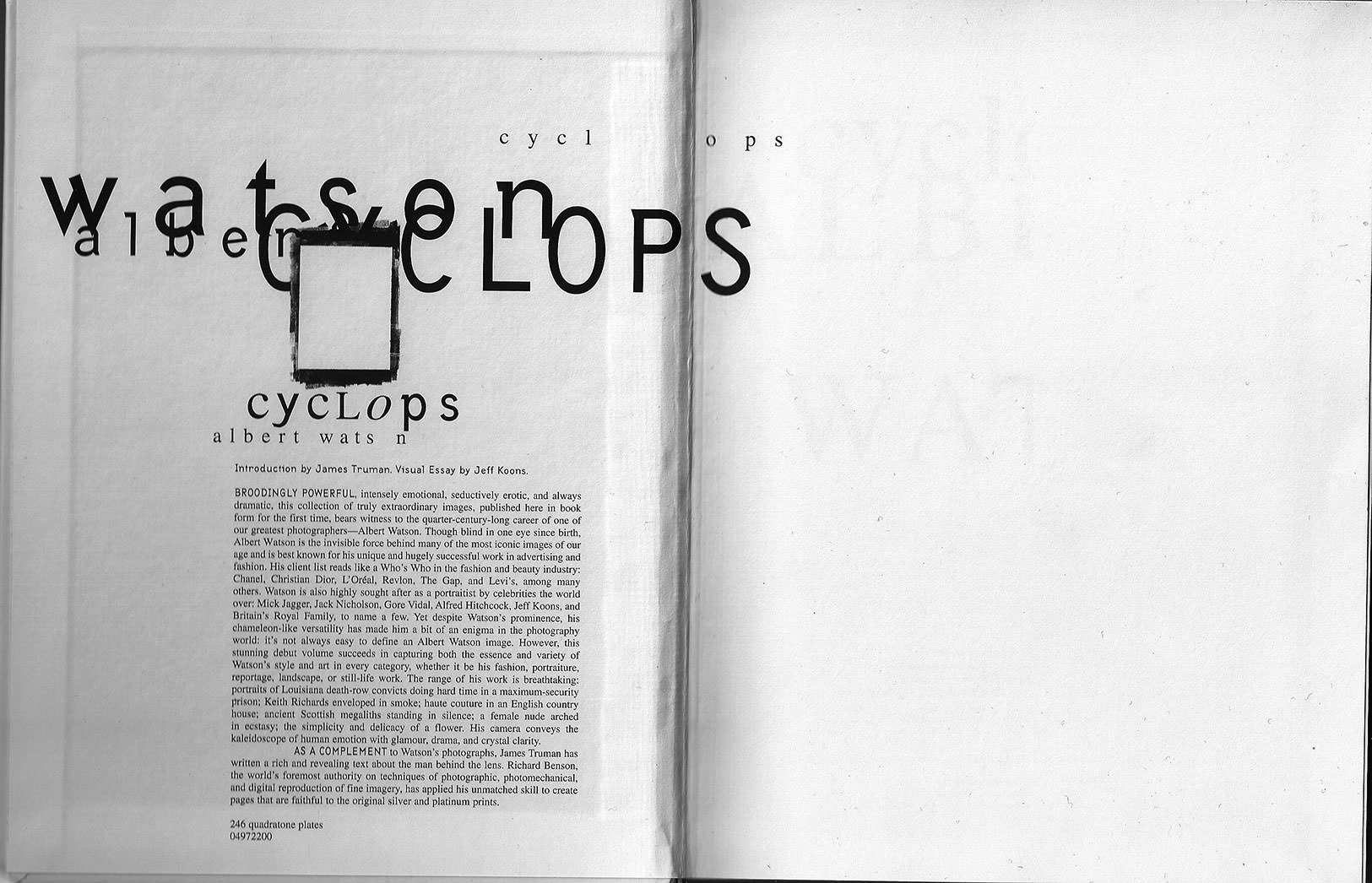
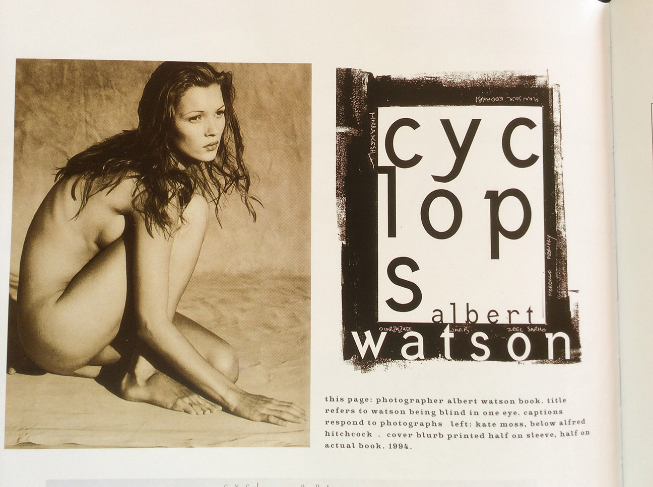
However, as someone who is also a graphic designer, what stole the show for me was the design treatment by David Carson. The individual attention given to the design of the captions and text in this photobook by the designer David Carson is incredible. Every photograph and piece of text is given it’s own personality–deservedly so–yet at the same time, everything feels like it belongs to the same family within the book. The treatment of the design and typography meet the task of matching the tone or content of the photograph(s) it is paired with; sometimes overtly, sometimes more subtly and abstractly. Rather than overpowering the photography–as you might expect would happen with the application of more expressive design–Carson’s design synthesizes with the content, creating a world and story that is unique to the book. A story that is told not only with photography but words, yet it must be seen and felt rather than read to be understood.